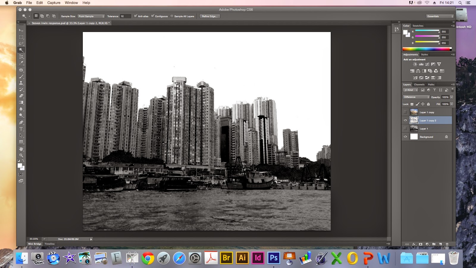
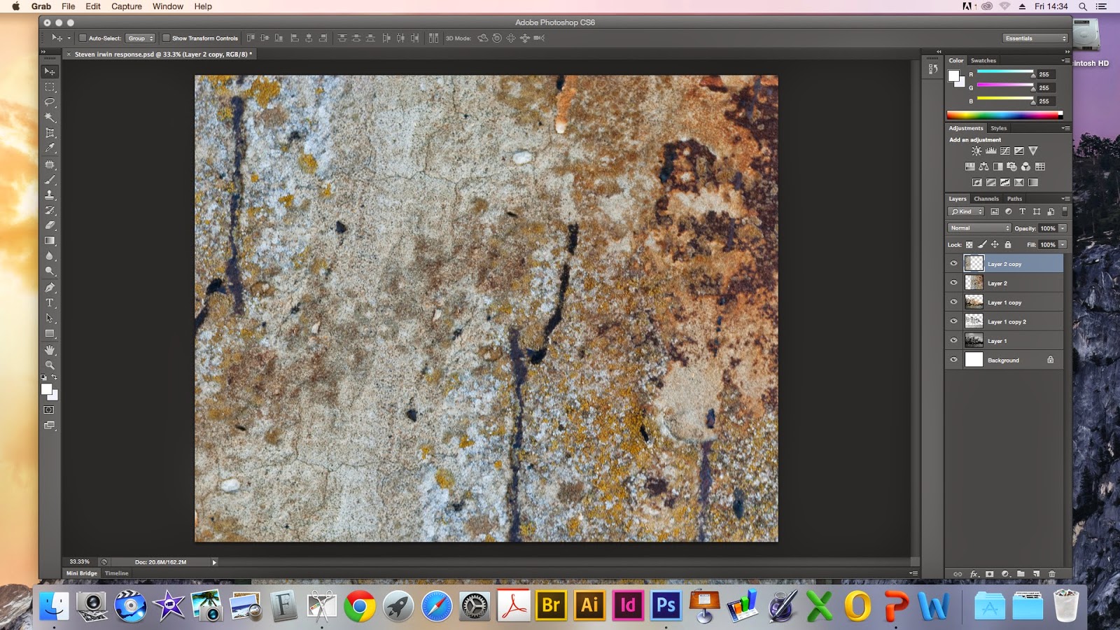
This work shop was to generate ideas for our project psycho-geography using Steven Irwin for inspiration.
Method:
- First you need to open up a new page in photoshop of 10 by 8. Then open up another page with your image on. Then holding down this tab move it away so it becomes a separate page, selecting the move tool move the page across to the 10 by 8 blank page.
2. Then you need to scale the image. To do this move outside the image until you see a double ended arrow. Holding the shift button down scale the image to fit the page.

3.Duplicate the first layer. This tool can be found at the top of the layers options and selecting the tool that has black lines running through it.
4.Then you'll need to do a black and white conversion. This can be done using the half white circle tool at the bottom of the layers bar.
5.Then using adjustment colours to make the buildings darker and the sky lighter.
6. Then merge down the layers using the grid tool along the top of the layers panel. Then duplicate the black and white layer.
7. After that you need to select layer one (layer one copy 2) then go to image -> adjustments -> invert to create a negative image.
8. Go to the normal layer and change the settings of the merger. (make the layers interact) First i chose lighten then difference.
9. Select the sky- Hide the bottom layer (clicking on the eyeball) select the magic wand tool, keep an eye on the tolerance bar keep this at 10. Click the sky then hold shift key to highlight more sky.Then select the lasso tool and holding alt to get rid of the pixels entering the buildings. Use the alt key to take away and the shift key to add. (make sure the tool has a minus beneath it).
10. Press the back space button to get rid of the sky. Then click the eye button on the colour layer to bring back the sky. Then press the back space button to get rid of the blue sky. Make all layers visible then do command D. Following this go to the top layer and select the soft light.
11. Open up the textured surface then move it across to your landscape image like step one. Then duplicate the layer again.
12. Then move the rust so they join together across two layers -> edit transform -> flip horizontally and vertically.
15. Merge layers again as you did previously. Then go to image adjustment and levels to make the rust more vibrant.Go to normal again and select multiply.
16. Open last texture surface. Then open levels to make it richer then go to select and choose colour range. Then go to image select the brown area, then click back on the selection and change the fuzziness to 100. Then select okay.
17. The go to edit select copy, then paste it onto the other page. Then select edit and go to transform to make the rust smaller then rotate it.
18. Go to the bottom of the layers and select the box with a circle in to bring out a layer mask.
Then select the paintbrush tool, make the brush big and hard. After that you need to change the opacity to a lower number. After that you can select an area to take away. I've taken away a section near the top of the building.
These are my two finished pieces. The bottom one has a different merger effect.
For my response i'm really happy with my outcome because I didn't expect to be able to produce something like this because digital art is definitely not my forte. I did two different versions I prefer the bottom one because of the orange along the boats I think it brings a little life to the piece. Also having the first layer of rust going along the whole landscape but more prominent in the corner really creates that decaying effect. It reminds me of the surface of the moon so it gives a surreal effect. The one thing I wish i could of improved is the sea, i wish i had made it more vibrant, or enhanced the shadows to give it a little more depth against the rust. For development I could try and replicate this using non-resistant materials like bleach and wax with ink?
Steve Irwin.
Steve Irwin's work explores the co-existence and tension between nature and man made objects, His work is produced using photographs that are layered up. Most of his compositions have the element of decay to show the dying cycle of life, His most recent work is what inspired my workshop. His use of urban landscapes is what links psycho geography. His work is trying to make a statement. He's showing the evolution of a space and how maybe this is a step too far like global warming increasing and other issues that don't get enough attention. His work evokes a strong emotional reaction from me because of the way he layers the city landscape and has the decaying rust, the contrast between nature and man made objects is strangely terrifying because both are powerful beings. The way he evokes this reaction is probably due to the city being the background and the nature laying on top along with the decaying element centred around the edges. Also the use of dull colours combine to produce an almost morbid but weirdly calming piece, almost as if the landscape is trying to return to nature.


No comments:
Post a Comment