Friday 21 November 2014

portrait lighting

Portrait Photography and lighting.

Key points to consider when taking portraits:

  • Make sure you set up your lighting equipment with care.
  • Consider the light angle, shadows and pose before recklessly shooting a portrait.
  • What depth of field will you need? Do you need props?
  • The sharpest element of the photo must be the eye so make sure that's where you focus the camera
  • Most of all make the model feel comfortable and clearly direct them. 
  • Additional information on location photos, you have to take into consideration your environment and background texture.
  • Also natural lighting from the sun. 
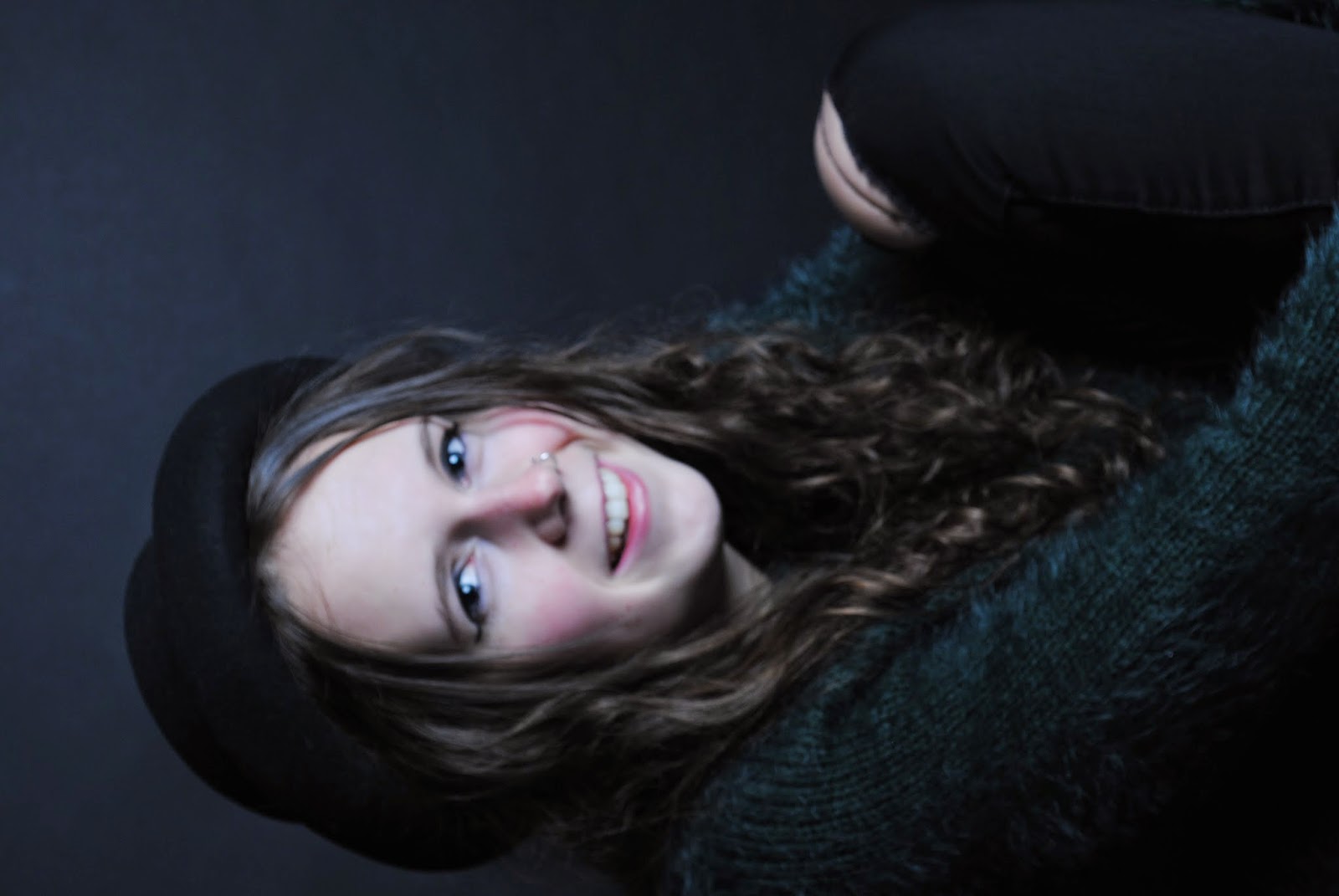
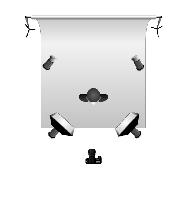
Below are examples of portrait photos taken in the studio. 

Below are portrait photos shot on location.


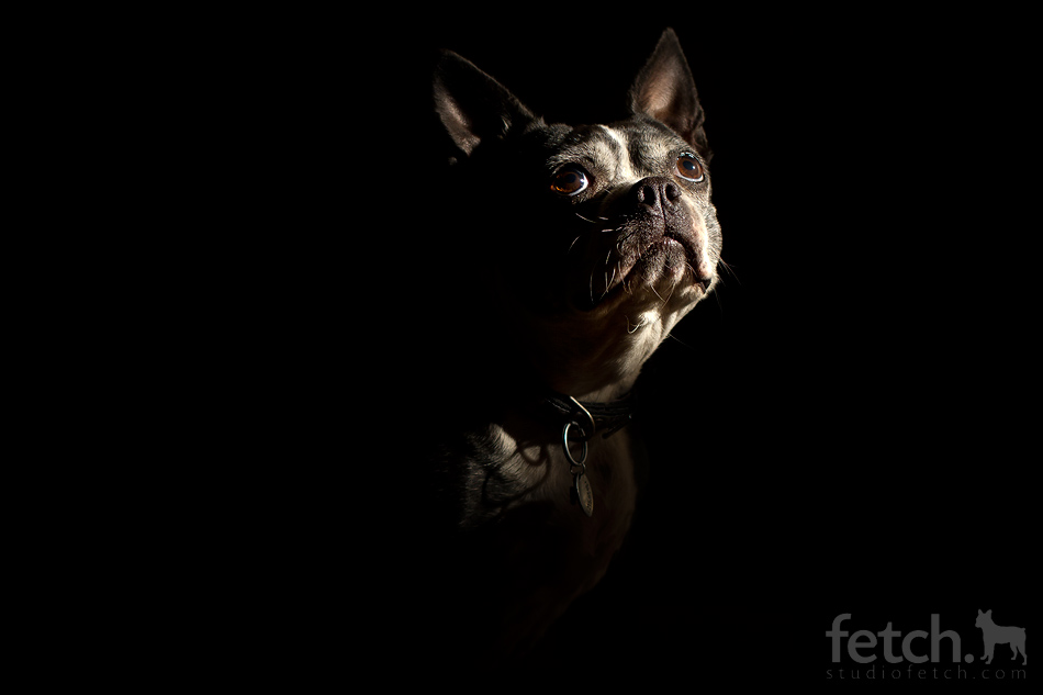
The camera settings for these photos were as followed. Manual mode with manual focus,1/60,f/8 and 200ISO.
Reviewing this photo I'm very happy with the outcome, the eyes are in focus, although the lighting could have been adjusted more because there is a lot of dark space on the right hand side by the jumper. The shadows produced on the face are very subtle which I like. Next time I would like to experiment in Photoshop and make it monochrome and enhance the grey tones. 


For my on location photo, I'm not that happy with them because I think i could have spent more time picking a more appropriate location, also I'm displeased with the focus point, the eyes aren't really in focus so I'm disappointed with the outcome. I think i need to revisit this workshop to gain better results and more practise. Although I'm happy that I was able to achieve this much because I thought I would have done a lot worse.


Dry pointing

Dry Pointing

Dry pointing is an intaglio technique, which involves the etching of an image onto a perspex or metal plate, with a needle etching tool. The needle is used as if it were a pencil, so you can replicate mark making techniques. This printing style can produce delicate and illustrative drawings. 

Method:
  • Gather your materials. See the list below.
  • Layer your plastic plate over your image, secure with masking tape. Then using a sharp etching tool, incise into the plate, using bold line, mark making techniques and a variation of pressure. (lots of pressure = bold dark lines visa versa)
  • Next is the inking up stage, wear gloves and an apron before yo start. Take a cardboard strip and rub a small amount of caligo ink (any colour) into the incised lines. Until your plate is completely covered.
  • Then using scrim, work in a circular motion. This does two things, 1, it ensures the ink is pushed into the incised lines and 2, it gets rid of excess ink so you're only left with the ink in the incised lines. 
  • Wipe off any excess ink on the surface of the plate. 
  • Then place your etched plate on the printing table. Lay a piece of dampened watercolour paper on top of your plate. Then proceed to cover with the felt blanket and roll it through the press. Carefully lift the print and leave to dry. 
  • Next clean off your plate with warm water. 
  • Don't forget to tidy your area. 
Materials:
  • Perspex plate.
  • Etching tool.
  • Caligo printing inks. 
  • Scrim.
  • Watercolour paper.
  • Printing press.
Health & Safety:
  • Keep are clean and tidy.
  • Keep area ventilated.
  • Wear protective clothing.
  • Use cutting mat when etching to avoid the plate moving.

Wednesday 12 November 2014

colour adjustments half term photo

Colour adjustment.

  1. First I selected the photo I wish to adjust. Then I chose to lay around with levels. To do this refer back to my previous post on photoshop. I adjusted the grey tones and white balance.


2. Then I created a duplicate layer, and going to the adjustment tool I changed it to monochrome, using the colour balance tool. I didn't adjust any other colour.


3. Next I revisited levels and changed them slightly to enhance the grey tone to bring out the mountain range.


4. Next I merged the layers together. If you've forgotten how to merge layers refer back to my previous post. I selected a soft merge because I didn't ant the monochrome to be too prominent.


5)Then i played around with layer masking, to select this tool go down to the bottom of the left hand side panel and select the square with the circle in. Basically masking layers allows you to remove elements of the top layer to show the later beneath. I chose to have the mask over my original adjusted photo.


6) Then using the painbrush tool I removed sections of the mountains to bring through the darker layer underneath. i left the clouds as they were because i liked the vibrant colour. I didn't use the mask on any other area because I just wanted the mountain to be in more focus.


7) I remerged the layers and this is the finished result.


Mono print

Mono Printing 

Mono printing is a printing method that produces a one off print. There are three types of mono print, subtractive, additive and painterly. 

Subtractive 

Subtractive mono print is a form of mono print where you remove layers of ink to produce a print. 
Method:
1) First get your plate to roll your ink out on and two rollers along with your ink colour of choice. 
2) Then with your ink pour out a pea size shape onto your plate. 
3) Using one roller, roll out your ink vertically then horizontally. Your ink will be ready to use when the ink sounds sticky. 
4) Then gather up the materials you wish to use to take away the ink from the plate surface. You could use a pen, tooth pick, cotton bud, cardboard, bubble wrap or paint brush. 
5) Then using each material create patterns within the inked surface. 
6) Once thats done you're ready to pass it through the press machine. 
7) Make sure there is news print laid down on the machine so the ink doesn't transfer onto the large felt sheets. 
8) Then place your inked plate onto the felt sheet, inked side up. Then cover with a piece of paper. Place the top felt sheet over the top and you're ready to roll it through the press machine.
7) Once its been pressed through you've completed the subtractive print. If there was an excess amount of ink you can pass it through the press again to achieve a 'ghost print'. 
8) Don't forget to clean up your work station, make sure you wash off the plate and rollers.

Additive

Additive mono print is where you add to the print with colour. 
Method:
1) Repeat methods 1-4 as said above. 
2) After you've gathered your materials place a sheet of paper over the top of the inked surface.
3) Using your material draw onto the sheet of paper to create a pattern or image.
4) Peel away the paper to reveal your design on the other side of the paper
5) To create a coloured print you've first got to add the coloured paper or paint before laying the sheet of paper onto the inked surface. 
6) Make sure you wash up your plate and roller.

Painterly 

For this method you directly paint onto the plate. 
Method: 
1) Grad your materials, ink, paint brushes, tooth picks, rags anything to paint with. 
2) Directly apply the paint to the plate and begin to paint to create a pattern or image. 
3) After you've finished place a piece of paper over the top of the plate, and using a barren slowly begin to apply pressure to the back of the paper in a slow circling motion. 
4) Once you've done that you can then put the print through the press machine to create a 'ghost print'. To use the press machine repeat steps 7-8 on the subtractive method. 

5) Make sure you wash up your plate and roller before leaving or adding new ink. 

Materials 

  • Ink 
  • Plastic plate 
  • Rollers 
  • Paintbrushes 
  • Tooth picks 
  • Rags 
  • Cotton buds
  • Bubble wrap 
  • Textured wall paper 

Felt making

Felt making.


Felt is a textile that is produced by the matting, condensing and pressing of fibres together. Felt can be made by natural fibres such a wool or synthetic fibres like acrylic.

The making of felt:
  • First you gather your equipment (the list is below). Lay you sugar paper down on a flat surface, then place the bubble wrap on top (bubble side up).
  • Next take your wool tops and pull out the end fibres, place them in a square each piece facing in the same direction. Build up until it becomes a dense layer. Then repeat the process but with the fibres going in the opposite direction. Make sure you cant see the bottom layer.
  • Build up 3-4 layers with alternating directions.
  • Then place a mesh netting over the wool, sprinkle warm water over the top of a netting then with your soap bar gently rub in the water. 
  • After this use your hands to message the soap and water into the fibres. If need be add more water so no area of the wool is left unsaturated. Then turn over the piece and continue the message process (the bubble wrap acts as another pair of hands messaging the other side of the wool)
  • Repeat this process until the fibres bond together. Then you can place it on the bamboo mat.
  • Roll up the bamboo matt and rub the matt between your hands, similar to how you'd start a fire with a stick. Continue this process until all the fibres have bonded. This rubbing process shrinks the felt piece so don't worry as the square becomes smaller. 
  • Once done rinse off under cold water. Then wash up your equipment. 
Equipment list: 
  • Merino wool tops.
  • Warm water.
  • Soap.
  • Bubble wrap.
  • Netting.
  • Bamboo matt.

Adding colour:
  • To add colour to the felt repeat processes 1-2, except instead of using the same colour wool top you can choose a different colour, so when you layer your fibres you can switch between the colour.
  • Then continue and use the same method for making felt to finish off the piece.
  • This then leaves you with a different coloured felt piece. 
Adding shapes: 
  • For adding shapes and form, repeat process 1-3. On the top layer of the fibres you can begin to make forms and shapes.
  • To make the shapes take the wool and cut shapes out of it and place it on top of the layered fibres, you can do this with different coloured fibres to make the shapes stand out. 
  • Another way to make shapes is to use the same process when layering the wool fibres. To make the shape layer the wool in the design of the shape but make sure the fibres are facing the opposite direction to the layer underneath. 
  • Then continue with the felt making by following the original method.
Colour mixing fibres:
  • This process is known as carding. A carder is a wooden brush that is covered by fine wires set into a rubbery base that's mounted on to the face of the carder. 
  •  You take two different wool fibres and place one colour on half of the left carder and the other colour next to it, each fibre has to be facing the same way. 
  • You take the right hand carder and draw it down the other carder in a brushing motion. this transfers half of the wool onto the right hand carder. 
  • To mix the colours you swap the brushes around so opposite colours brush together, you do this until you have achieved your desired colour.
  • To remove the coloured fibres you take the left hand carder and brush it down the right hand carder this places all the fibres onto the right carder.

Hand stitch

Hand stitching.


There are different type of hand stitching. 
  • Running stitch- Its a simple basic stitch that consists of a line of evenly spaced stitches, which run back and forth without over lapping. 


  • Backstitch- Its similar to the running stitch but its sewn one stitch length backwards on the front side and two stitch lengths forward on the reverse side. This forms a solid line. 


  • Blanket stitch - Its a buttonhole stitch that is used on the edges of blankets that are too thick to be hemmed. Its called a decorative stitch.  

  • Chain stitch- Its a serious of looped stitches that link together to form a chain like effect.


  • Fly stitch - Also known as feather stitch. It's an embroidery technique that uses open looped stitches that are worked alternatively to the right and left of a central rib. 


  • Couching - Its a technique where a material is laid across the surface, it is fastened in place by a series of small stitches. Its a very simple but decorative stitch.  


  • French knot - This stitch is made by winding the thread one-three times around the needle and then drawing the needle back through the material near the point of entry. They are usually used to represent flowers. 


  • Seeding - Its a short straight stitch placed in random directions to fill in backgrounds and add texture. 


Hand & felt stitching onto felt samples: 
  • To hand stitch onto felt samples you just treat the felt like you would a normal material and sew straight onto the surfaces. 
  • For machine stitch you use the free hand foot on the machine and then begin sewing. 

Health & Safety.
  • When dry felting be careful when using the needle. 
  • Be careful when using the needle for hand stitching, if you prick your finger place it under cold water. 
  • When using the sewing machine never leave the applicecne unattended 
  • - Always unplug the machine after use
  • - Make sure all air openings are clear before use of the appliance. 
  • - Keep fingers away from the needle.
  • - Do not use bent needles 
  • - Set up the machine before turning it on.
  • - Use the provided handle for lifting the machine.
  • - Do not have any liquids near the machines 
  • - Do not wear earphones when on the machine. 
  • When making felt be careful not to make the water too hot. 


Altered book

Altered book.

An altered book is a form of mixed media where the subject (e.g a book) is altered either by appearance or meaning. This alters it original form. 

Methods: 
  • Preparing the book- First you take a used or second hand book. You've first got to separate the book in half to prepare your niche. Take the back half of the book and layer the edges in PVA glue using a piece of cardboard. This is a quicker method then sticking each individual pages. Leave to dry. 
  • - Once its dry or while its drying you next have to filter out the pages in the book. Do this by tearing out every 2 pages. By doing this you want to end with about 30 pages left. Next you want to make the pages bigger by sticking 3 pages together to produce 10 thicker pages. To stick the pages together use PVA glue. Leave to dry. 
  • Illustrations- To do the illustration, first pick a page and pick a word from the text and draw a image either relating to the word or literally what the word is. Another way to pick what kind of illustration is to choose a theme for the whole book and draw from that. For my altered book I chose an illustration of a wolf, as my theme was more fairy tales. To do my wolf I first drew the outline on a blank page right before my niche and then filled it in with a graphic liner pen.  
  • Adding text- Adding text is similar to illustrations. Either pick a word from the text and add a phrase relating to it. Ways of adding text is isolate certain words from the text by using white acrylic or black to block out the words and create a phrase within the text. Or you can cut out the words in the pages using a craft knife. I chose to use stamps to add text, I used it on the same page as my illustration choosing the phrase 'lone wolf'. By using stamps I had no need to block out text with paint. 
  • Tags- For the tags you take a template of the shape and size template you desire, trace that then cut it. Alternatively you can cut it out freehand. Next is to decide what goes on your tag. For me I chose a word from my text and used that to create a welcome tag. For my tag I used the technique of sgraffito, so when i wrote my welcome sign the coloured paint would come through. I kept the top layer of the tag earthy brown to fit into the forestry style. On the back I add some more text. To tie in the tag i used a simple wire string and stuck it down with masking tape. To make the tag fit in i also painted a forest wash background with watercolour.
  • Pop ups- To achieve a pop up effect, you cut out a square of paper and fold it over. Then on the creased edge of the folded page you make two identical slits with scissors near the centre. You then pop that out and push it through so it pops up against the fold. Then you have to decide what you want to be your pop up. I picked the words deer and forest from my text, After drawing them out I stuck them onto the pushed out section of the flap. You then have to stick them in the centre of the book, where the pages meet. This creates a pop up effect when you open the book. 
  • Niche- This is the final development of the altered book. You first need to cut out your niche so draw a square or rectangle and using a cutting board and craft knife, take a layer away at a time. Once you've cut through the paper you can glue the inside edges of the niche to make them smoother. You then need to decide what you'd like to place in your niche. For my niche I developed a 3D effect by painting in a woodland back drop, and adding in paper layered trees to give off the idea of depth. To stick the trees down I used double sided sticky tape on the flap at the bottom and on top,  
  • Cover of book- You can do this if you'd like to change the cover of your book. For mine i just stuck down ripped pieces of text and covered the front and back of my book. You can cover your book in all different ways from painting, collage or using already ripped out text.


Health & safety
  • Be careful when using the craft knife, always cut away from you and be careful where you place your fingers. 
  • When gluing the outer edges of the niche use cardboard to avoid paper cuts. 
  • Don't run with scissors in your hands. 
  • Clean up your area once you've finished. 

Ceramic studio

Ceramic studio health & safety.


  • Health & Safety.
  • Clay dust- This can be very dangerous is inhaled over a long period of time. 
  • Use a wet sponge to clean up clay dust.
  • Always wash off your equipment after use. 
  • No eating in the studio.
  • Keep the room we'll ventilated 
  • Use a bin to collect scrap pieces of slip.
COSHH HEALTH AND SAFETY:
- Ceramics work can produce airborne respirable crystalline silica (RSC)
- RSC can cause silicosis which is a serious lung disease that causes disability and early death, this can be made even worse by smoking.
- The term respirable means the dust can penetrate the deepest part of your lungs, the finest dust isn't even visible under normal light. The dust can be caused by drips and spills that are left to dry.

Key words
Bisque-  where the clay has been fired once and has no chemically bonded water left initial.
Leather hard- is the stage during the drying of a clay piece. At this stage, the clay is still damp but is dry enough to not become deformed when handled. The clay is able to be gouged or incised without breaking.
Slip-  a slurry of clay and water used for high firing glaze.

BISQUE FIRING TIMES 


Wednesday 29 October 2014

High key and low key lighting

High & low key lighting.

  • Low key lighting produces dramatic lighting effects caused by strong directional light from one side of the subject, this causes deep shadow areas. For low key lighting to work there needs to be no background lights, darker backgrounds work best. Sometimes with low key lighting 1-3 flash units are used, but only one is used as the main source, the others are fillers so they're set on a low intensity, sometimes instead of using more flash units reflectors are used. 
Low key lighting set ups .Flash head and reflector will produce shadows. 

  • High key lighting is the opposite of low key, the background needs to be over-lit making it pure white. Usually two lights are used for the background and they're normally two stops greater then the front lights. In addition a light table can be used to back-light the subject to increase tonal definition and colour. 
                                     High key lighting set up, over lit background.


Examples of high lighting:


Examples of low key lighting:


Equipment list.


  • Flash unit. - Its used to produce a flash or artificial light. It also helps illuminate a dark scene. Other uses are it helps capture fast moving objects.
  • Snoot. - Its an accessory to the bulb, usually used to back light a models head, giving a spot light effect. It controls which areas are illuminated. 
  • Reflective hood.- It goes on the end of the lens like a lens hood, it blocks out the sun or other light sources to prevent glare and lens flare. 
  • Barn doors - They're usually fixed onto studio lights, they have 4 hinged doors around the light source. They're usually used to shape light, they don't have any effect on the hard/softness of the light.
  • Light stand - The basic use of these is to position all different types of lighting, clamp on reflectors, diffusers. Or hold backgrounds and props. 
  • Soft box - Its a type of photographic lighting device. Its used to vary soft light by directing light through some diffusing material or bouncing the light off a second surface to diffuse the light.
  • Diffusive umbrella - This helps illuminate the scene, the flash is directed to the underside of the umbrella (white side.) This allows some light to pass through and illuminate the surrounding so rather then reflected diffusion its direct diffusion. 
  • Reflective umbrella - A flash of light is directed to the black under side of the umbrella, this causes the light to be reflected back to the scene. The open parabolic shape diffuses light over a wider area. The light is scattered because of this.
  • Reflectors - It is a surface used in photography and cinematography to redirect light towards any given subject or scene.
  • Trigger and receiver - Its used in flash photography, they help co-ordinate the flash of the light with when you take a shot. The trigger is on the camera and the receiver is placed on the light.
  • Light meter - Its a device used to measure the amount of light exposed. It usually also allows the photography to determine the shutter speed & f-number for optimum exposure.

Health & safety 

  • Make sure that you carry all equipment by the specific handle, or correct procedure. 
  • Always uncoil wires when you're using the equipment. 
  • Don't mess around with the equipment, especially the stands in case they fall.
  • Place bags under tables so people don't fall.
  • Be careful of equipment as they can heat up during use


Friday 24 October 2014

illustrator

Illustrator

This is a step by step guide on how to use the pen, shape and colour options on illustrator.


  • First open up illustrator, select file at the top and click new. This brings up the box you see above. Decide whether you want your page landscape or portrait then click okay.


  • Once I selected my page, i went to file and opened up my kandinsky image, as id be using it to help me understand the pen, shape and colour tool. 


  • Once I'd opened this I created a second layer, i placed this under the top, (layers work in hierarchy) so even though I'd be drawing on the original image it would be tracing it onto the layer underneath. 


Using the tools.


  • Using the pen tool. The pen tool works by connecting anchors. First select the pen tool, then place it where you want the first line segment to be. Click down and then move the mouse over to the next spot and click again, do not drag the mouse. You repeat this procedure of using anchor points to create a continuous lines to draw squares and shapes. To stop the pen tool you you position your mouse over the first anchor point, A circle should appear next to the tool, click down and this will stop the anchor path. 

  • To draw curves with the pen tool, you place an anchor where the curve to changes direction. Position the pen tool where you want the curve to begin and hold down, the first anchor point and the pen tool pointer changes to an arrow head. You then drag to set the slope of the curve segment, then release the mouse.Then position the pen tool where you want the curve to end.


  • For a c shape follow the diagram below. You drag in the direction opposite to the previous line.


  • To draw shapes, first locate the rectangle tool on the side bar. The default tool is the rectangle but this can be changed by clicking and holding the rectangle tool. This reveals a hidden tool bar. Select which ever shape you need. I chose the ellipse tool for drawing circles.


  • To draw a shape you click and grab. To draw a circle you click and grab while holding the shift shift key.


  • For the colour option. You would usually use the fill tool once you've drawn your shapes. Taking a colour from the colour pallet and simply filling in the area. Where I had the original Kandinsky photo I used the eye drop tool to copy the colours off Kandinsky's work.This then changes the colour in the colour fill tool.
  • This was the finished product. I didn't have time to finish it but it gave me the basic understanding of how each tool works.


Colour adjustments screen grabs


Colour adjustment.

This post is to show you how to do colour adjustments on photos on photoshop.
  • First off open up photoshop then up load your image. To find adjustments you go to image => adjustments. This then opens up a list, to start with you want to just play around with brightness/contrast, levels, curves and exposure. 


  • Then proceed to pick one of the adjustments, I first went for brightness and contrast, this changes the dark and light tones within the image. I personally left mine how they originally were. Don't forget to save your changes 


  • The next one was curves. The curves adjustment is probably the most powerful, and it works by tweaking the central line and placing anchors along the path. By changing the path of the original diagonal line you can change the tonal out point on the image, I enhanced the orange within the wings of the butterfly.

Photoshop curves sample window


  • This image shows two anchor points on the curves graph and how each point effects the original image.

  • The exposure adjustment works by adjusting the highlighted end of the tonal scale. It doesn't do much difference to the darker areas, so it was really effective on the wings of the butterfly.


  • The last one is levels, and personally this is my favourite one to play around with because you're only using three main components, a black point, white point and midtone slider. Its shown as a histogram. The black point controls the amount of black in the image and the same happens with the white point. Adjusting the midtone is probably the most important, if you slide it to the left the histogram stretches to the right, which compress the histogram to the left. This brightens the image because the shadows are stretched and the highlights compressed. Visa versa.


  • This was my final outcome once I'd finished playing around with the colour adjustments.


  • I then went a step further to merge two different layers. I made a duplicated layer. You click on the layer icon below the adjustment pallet. 


  • This grab shows what comes up after you click duplicated layer, just naming the layer, press okay then you have the same layer repeated twice. Next to the layers you have little eye icons, click on the eye that belongs to the original layer. This means you only see the effects of the duplicated layer.


  • Next I went back to the adjustments, instead of using the original four I went further down and selected the black and white adjustment, which automatically changes the image to mono chrome. You don't have to make the image black and white you can merge two coloured images.


  • After I made the butterfly monochrome I decided to just merge the layers as they were. To do this there is a button above the layers labelled normal, click on this and it brings up a list of options. These options are different effect on how the layers merge together. Have a play around here and see which effect you like best. 


  • This is my finished result after the merging.