Monday, 1 June 2015

Logo timelines

The company apple has evolved their logo over many years to keep it relevant and modern with the every changing current of society. Most people don't think much into the hidden meaning behind the apple but it's there. Even their first logo was related to an apple because it had Isaac Newton in, and when he discovered gravity and colours from an apple falling on his head. This logo was short lived though as rob janoff soon changed it to the simple design of an apple with a bit taken out, which was multicoloured. But again the times changed and the apple logo had to become more modern more simplistic. It first became monochrome but now it alternates between aluminium and  White. Over the years it's become more modern and it's so well known now that the company doesn't even have to put their name next to it, because the apple is iconic on its own already.
.Image result for apple logo timeline

My next company is nike. The Nike "Swoosh" is a design created in 1971 by Carolyn Davidson. The name nike was placed over the tick using a typeface that involved serifs. It then changed to San-serifs a more bold typeface with the tick placed underneath. The colour scheme changed when the third modified logo came about, to red and white, the logo had also been placed In a box. Till finally we come to the logo we all know today with is the simple red tick. The name nike is mo longer needed because it's automatically associated with Nike. The hidden meaning behind the tick isn't very clear, people have different assumptions.

My final company is the wwf and their famous panda logo what was inspired by the giant panda chi-chi. The first sketches were done by sir Peter Scott, they wanted an animal that was endangered but loved by all. It also had to have a big impact on black and white to keep printing costs down. Then over the years the logo has been tweaked to become more modern and sleek. Gone are the big bulky black lines they're replaced by the simple white back ground, the rough sketches have become softer the lines more carefree but precise. Even the shape has matured and grown to look more like a panda so it's easily recognised. And now it's one of the most well known logos of the century. 

Spray paint experiment


Spray paint experiment. 
For this experiment I played around with using stencils and stray paint, but also using acrylic paint to see if they could recreate the same effects. These techniques are how I created my graphic image. 

Method for the stencil.
•First you'll need to collect your equipment which will consist of a pencil, paper/card, craft knife and a cutting mat. 
•Next you'll need to draw out your design. For me this was a leopard in three stages of movement, leopard prints and bars around the leopards body.
•Once you've drawn your image using the cutting mat and craft knife start cutting out elements of the image that you want printed, make sure you work from the inside out. 
•Then once that's finished you can clean up your area and then you're ready for the next stage with is using spray paint. 

Spray paint method:
•First you'll need to collect your material which will be your stencil, spray paints, news paper, face mask, goggles, gloves,paper and blu tac.
•Now you're ready to start, first you stick down your stencil on to the paper using the blu tac, then either going outside or into a well ventilated room, shake your spray paint for at least 30 seconds, before using it. Make sure you're about 30cm away from the paper before spray painting. Don't forget to wear your protective  clothing before starting. And always put news paper underneath the paper to avoid getting the spray paint onto surfaces.
•Once that's done you can begin to spray paint. Making sure to cover all the areas but not getting too close to make the paint wet and run. 
•It dries fairly quickly so you can move onto other pieces. Try spray painting each piece. 
•If you find that the paint runs, spray the paint into a bowl and use a sponge to dab the paint on, this gives you the same effect. 
•The spray paint didn't work very well for the leopards body so I used acrylic paint to dab on the colour using the stencil. Also for the moment of the leopard I used the inverse stencil, the bit I cut out of the stencil to create a positive a negative piece. 
•Once you've finish your work clean up your area and wash the paint off. 

HEALTH AND SAFETY 
•Repeated exposure may skin dryness or cracking.
•The aerosol is flammable so be careful where you store it.
•Can cause eye irritation.
•Wear protective clothing like gloves, mask and eye protection.
•Use only in well ventilated areas or outside.
•Keep away from Sparks and open flames.

Thursday, 28 May 2015

my poster design


For my poster design I edited it on photoshop. The process was fairly easy I just played around with layout and type faces till I was happy. For the logo I just cut and pasted it across. The tricky part to my poster design was my graphic image was too big for the scanner so I had to scan it in two pieces then merge them together using the clone tool. Which works by pressing the alt key to select colour and then copying that information to your desired area. To get rid go any imperfections within the piece. I then played around with layout and type. Below are the experiments I conducted. Each are produced with the simple tools of select, type and cut and paste. 


Wednesday, 13 May 2015

logo design

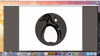
My logo experiment started off with just using pen and pencil to come to this desired outcome. It took a lot of editing like making the body more rounded and simple, even debating whether to keep the feet. So I drew out my logo ,multiple times until I was happy with the outcome. Once that was done I edited it on illustrator.

First I scanned in the logo then creating a new layer I basically copied each line using the pen and anchor tool. Then filling in certain areas black with the fill tool.

I created new layers for each section of my logo, I kept referring back to my original copy and making slight adjustments to make it look more modern and sleek. One change I made was with the flippers instead of outlining it like I originally had I just left it with the black area so my logo appeared simplistic. I also added colour to the tag so it would stand out against the black and white.


This is my finished logo before I played around with background colour. Below are some of the tester samples. I used the shape tool to create a simple circle around my logo and filled it with different colours. I also tried changing the white within the penguin to a different colour. To do that I just had to select the areas I wanted changed and fill them. For my final logo design I chose to put a grey circle around the penguin to give a modern and simplistic finish.


Tuesday, 12 May 2015

Screen printing

SCREEN PRINTING

Screen printing is a printing technique that uses a woven mesh stretched over a wooden frame to support an ink-blocked stencil to receive a desired image. Ink is moved across the mesh using a squeegee. The squeegee forces the into into the mesh openings transferring the design onto the surface beneath. There are two different types of stencils photographic and paper. To print a photographic stencil the mesh is coated with a light sensitive emulsion which when dries blocks holes in the mesh. To expose one onto a coated screen the image needs to be a positive image printed on either acetate or folex. to achieve a good quality image the design needs to be solid black. This film positive and the screen are exposed to uv light. The screen is than washed with a jet to reveal the image. Then using a squeegee and acrylic mixed with a printing medium, its pulled across the mesh to reveal the image. 

We used this technique to achieve a basic understanding of how posters can be created. 
EQUIPMENT:
- Squeegee
- Stencil ( news paper) 
- Photographic stencil
- Screen (mesh and wooden frame)
- Acrylic paint mixed with printing medium. 
- Cutting mat and craft knife

Method:
  1. First you need draw you stencil on news print, then using a craft knife carefully cut out your stencil.
  2. Then using brown tape, tape up around the edges of the frame and any parts you don't want printed. Make sure to cover your area with news paper. 
  3. Place your paper under the frame. 
  4. Apply the ready mixed acrylic, close to the area you want to print but not on the design.
  5. Than either using clamps or getting someone to tightly told the frame, pull the squeegee at a 45 degree angle towards you in a firm motion. Make sure the pressure is even. 
  6. Carefully remove the screen from the paper underneath, put the print on a drying rack. 
  7. Take the tape off your screen and put any excess ink back into the pot and wash the screen. 
  8. Make sure you keep your area clean. When you're not printing clean the screen, if you don't the ink will dry out.
Method for photographic screen:
  1. The methods are exactly the same except you don't need to do a stencil.
Health & Safety 
  • Keep room well ventilated 
  • Do not inhale the pigments/chemicals 
  • Keep your area clean and tidy

Shepard Fairey is an American contemporary street artist, who emerged from the skateboarding scene. He is best known for this posters produced during the election in america for Obama.  He uses simple colours such as black, white and red. His work combines elements from graffiti, pop art, buisness art and marxist theory. His main mediums are often stencilling, collage and screen printing, to produces very bold pieces of work that relate to the problems facing the world in the current times. He is very much an important artist to look at when it comes to creative advertisement, although he has been done for plagiarism, there isn't a defined line between his work and Andy Worhol, who is now a celebrated artist. 

Friday, 27 March 2015

Artist movements

Artist movements
18th century - 19th century 
Modernism is related to current times, but it can also mean the relationship to a set of ideas that, at the time of their development, were new or even experimental. The birth of modernism and modern art began in the 18th century to the 19th. Prior to the 19th century, many artists started to make art about people, places, or ideas that had interested them. Modernism refers to the type of materials and expressing feelings and ideas by creating abstractions and fantasies, rather than displaying what is real.  It  consists of a variety of artistic movements such as, symbolism, dada, surrealism and futurism. There are various painters likeVincent Van Gogh, and Paul Cezanne.
Trees in Park at Jas de Bouffan - Paul Cezanne

1916-1922
Dada is and art movement that started during world war 1 as a form of protest as the people of France and Germany had to find refuge in Zurich. They were angry that the war was allowed to happen so they began protesting through word based art. Dadaists used any form of public forum (a place where people could meet and discuss) to make a mockery of structure, everyday objects, create obscenities,
scatological humour and visual puns. The art movement ran from 1916 – 1922 and some key artists of the movement include Francis Picabran, Alice Bailly and Marcel Duchamp.


1924-1945
Surrealism is a form of art which began in the 1920’s of writers and artists such as Salvador Dalí and René Magritte. These artists experimented with the ways of unleashing the subconscious imagination
And to make the mind curious to what is the meaning behind the picture. They wanted to recreate there dreams into a piece of work, and this linked to the unconscious mind. ‘The art surrealism was created in the 1924 and ended 1945.
The main artists that were linked with surrealism were; Salvador Dali, Rene Magritte, Pablo Picasso
and Andre Breton who started the art form in the first place.

Image result for salvador dali clocks
1940-1950
Abstract Expressionism is a development of abstract art that originated in New York, in the 1940’s and the 1950’s. It aimed at personal feelings, tastes and opinions as well as emotional expression with particular emphasis on the spontaneous act of creating art. Abstract Expressionism was first influenced by mixed media paintings in the 1930’s, but became a fully formed art movement in the 1940’s and 1950’s. It still carries on to the present day. Hans Hofmann was one of the main influenced artist.


Different types of mounting

Presentation techniques 

This post is about the different presentation techniques that could be used for my purposed final outcome. 

Flat mount- This presentation is where you fix your work to mount card either by double sided tape or adhesive spray. To add a more finished look you can have a 1mm or 2mm black boarder around your image before its applied to the card. 

Suspended- This technique involves hanging your piece of work from the ceiling using wire. This technique usually takes place in galleries. 

Float mount-  This presentation can be produced by various materials such as foam, wood and aluminium. This technique gives a contemporary finish to flat pieces of work.  The board tends to me smaller than the image to give the illusion that the image is floating

Flat wall mount- This technique is where you directly stick your artwork onto the wall using an interlocking method of wire/string and sticky pads

Window mount- This method is more traditional. You cut into a board thats just slightly smaller than your artwork then using sticky tape you fix your piece into the board. This can then be covered by a glass panel to produce a professional finish.