
My logo experiment started off with just using pen and pencil to come to this desired outcome. It took a lot of editing like making the body more rounded and simple, even debating whether to keep the feet. So I drew out my logo ,multiple times until I was happy with the outcome. Once that was done I edited it on illustrator.

First I scanned in the logo then creating a new layer I basically copied each line using the pen and anchor tool. Then filling in certain areas black with the fill tool.

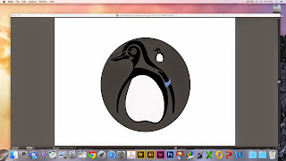
I created new layers for each section of my logo, I kept referring back to my original copy and making slight adjustments to make it look more modern and sleek. One change I made was with the flippers instead of outlining it like I originally had I just left it with the black area so my logo appeared simplistic. I also added colour to the tag so it would stand out against the black and white.


This is my finished logo before I played around with background colour. Below are some of the tester samples. I used the shape tool to create a simple circle around my logo and filled it with different colours. I also tried changing the white within the penguin to a different colour. To do that I just had to select the areas I wanted changed and fill them. For my final logo design I chose to put a grey circle around the penguin to give a modern and simplistic finish.


No comments:
Post a Comment