Wednesday, 11 February 2015

Lino print

Lino printing

This is another form of print making that revolves around a relief printmaking method. This means that the ares that is printed is taken from the highest surface.

Method: 
  1. First you'll need to gather equipment which will consist of, tracing paper, lino block, lino tools. 
  2. Then you'll ned to trace your image or map onto tracing paper using a pencil to get a rough outline on your lino block. Make sure you have drawn your design backwards on your block as otherwise when you print your print will be reversed. 
  3. Next to avoid confusion later on mark the areas you don't want to cut with a marker pen. 
  4. Now you're ready to begin cutting. 
  5. Set up your lino tool selecting the correct size for the area you wish to cut. Make sure the handle is tightened to prevent the blade from slipping. Make sure you cut away from yourself. Then proceed to cut out the areas of your design you wish to not be printed. 
  6. Then you're ready to print. This process is similar to monoprinting. You need to gather your equipment which will be a plastic board for rolling ink, rollers one to ink with and one to burnish the print, and ink.
  7. Then you'll need to use two types of ink, one water based and an oil based one. You'll also be using the albion press. 
  8. Roll out your ink thinly until you hear the squeaky sound. Then use the roller and cover your lino print with ink. 
  9. Then select what you surface you wish to print into. 
  10. To use the albion press you need to take the handle at the side and roll out the board to do this push the handle towards you. Place your lino block and paper between the sheets. Then pull the handle towards you to bring it under the press. 
  11. Then using the lever in the centre of the press pull that towards yourself to lower the press. Then push it away to relieve the pressure and the ink should of transferred. 
  12. The other way to transfer the ink is by hand. Re-ink your lino print and then place a piece of paper over the top and using a dry roller gently roll over the top. Apply a little pressure and the ink should transfer.
  13. Try both of these's methods twice and on different surfaces to get a variation of results.
  14. Once your're finished clean up your area and wash you block, boards and rollers with warm soapy water.

Health & safety
  • Always cut away from you and keep your hands out of the cutting line. 
  • When printing it is advised to wear protective clothing such as an apron and gloves. 
  • Clean up your area. 


Procion dye, dissolvable fabrics and disperse dyes

Procion dye.

This workshop was introduced to use to show us an alternative way of layering an image with fabric and how to replicate colours using procion dye and dye baths.

Method: 
  1. First you need to select an image you wish to recreate and note down all the colours you can identify within the image. 
  2. To mix the dyes you first need to measure out 500ml of water. Then gently use 1/4 of a dry teaspoon of powder into a cup with a small amount of water. Mix with the teaspoon. Write down the colour used. Remember to rinse and dry the spoon for each colour. 
  3. Add more powder depending on the colour you wish to create. Once you have your desired colour pour in the remaining water and stir well. 
  4. Then add 1 teaspoon of salt per 500ml of dye. 
  5. Also add 1 teaspoon of soda ash per 500ml of dye. This fixes the colour to stop it fading. (if you wish to produce a lighter faded colour don't add the soda till after.)
  6. Repeat this process for each colour. Your dye bath is now ready for fabric.
  7. Gather your fabrics. Calico, cotton and silk. Add different fabrics to the baths so you have a mixture of colour and texture. 
  8. Next you need to wet your fabrics in water. Then you need to place them in the dye baths for different amounts of time. Some for 5 minutes then others for 15,30 and 60 minutes. 
  9. Once the time is up take them out (make sure you're wearing gloves) Rinse in cold water then leave to dry on a paper towel. Alternatively you can dry it using an iron. 
  10. Then record your findings making sure to list material,colour and how long you left the fabric in for. 

Dissolvable fabric.

Method: 
  1. You'll need to gather you're equipment which consists of an embroidery hoop, sewing machine, dissolvable fabric 
  2. Cut a piece of dissolvable fabric larger than the embroidery hoop you've chosen to use. Make sure the fabric is doubled over. 
  3. Next draw your image in the centre of the fabric. 
  4. Then loosen the screw on the outer hoop and take out the inner hoop, next you place your fabric over the outer hoop right side up. Make sure your image is in the centre of the hoop. 
  5. Position the inner hoop on top of the fabric so that it sits within the outer hoop. The fit should be tight.
  6. Then adjust the screw to make the hoops fit tighter, then gently pull the fabric to make it tight all the way around. 
  7. Then set up your sewing machine and begin to stitch your pattern using the embroidery foot. (All stitches must overlap to ensure the piece does not come apart when the fabric is dissolved.)
  8. When finished take the fabric out of the hoop and run it under cold water. This dissolves the fabric. 
  9. Then lay the stitch down to dry. 

Disperse dyes. 

Method: 
  1. First you need to take note of the colours in your chosen image, following this you need to select the relevant disperse dyes. 
  2. Pour these into a palette then using a paint brush paint each colour (as squares) on photocopy paper. Do this twice as you'll be printing onto two different fabrics. 
  3. Then leave to dry. 
  4. Once dry you can use the heat press. 
  5. To do this switch the press on from the mains, then set to the desired temperature of 180 degrees with a count down timer of 30 seconds. 
  6. Once the heat press is ready place you photocopy paper between one piece of silicon with your sheet of calico or polyester on top of your paper. Then place another silicon sheet on top. Then using the handle clamp down the press, at the same time pull the small black knob to the left. When the timer beeps lift the handle while releasing the knob again. 
  7. Repeat step 6 using a different fabric and your other photocopy paper. 
  8. Then using your photocopy of your original image and paint over it with disperse dye. The black areas will repel the dye. Then print again using the heat press. 
  9. Once thats done you need to paint your image using the dyes and print it on your chosen fabric. 
  10. Clean up your area once you're done. 
Heat press Health & Safety
1. Ensure heat press is clear from obstruction.  
2. Let others in the room know it is on.  
3. Do not leave the press un-attended, someone must be in the room at all times.  
4. Take care when removing items from the press, as covers are very hot. 
5. Do not ware loose clothing when operating the press. 
6. Ensure others are clear of moving parts.  
7. Turn press off by switch and plug socket when finished.

Health & Safety with procion dye:
  • gloves,masks and aprons must  be worn. 
  • Always be careful when working with dye powders, try not to shake or spill them. 
  • Work in well-ventilated areas and do not inhale powders. 

Friday, 6 February 2015

Papercuts

Paper cuts.

The idea behind this workshop was to learn about and how to produce bridges and silhouettes using paper cuts. 


What is a silhouette?

  • A silhouette is a dark shape and outline of someone or something visible in restricted light against a brighter background. 

What is a bridge?

  • Bridges allow you to create a shape within a shape, it is a common technique used when working with paper cuts. This bridge allows you to have light and dark areas within a design which cannot be achieved with silhouettes.  
  • For bridges to work its important that all your designs are joined up before you start cutting. Also bridges work well when they're added into shapes of an image.
Method: Silhouettes 
  1. First you need to get an image you wish to use to create a silhouette. 
  2. Next gather your equipment which will consist of, black card, tracing paper, craft knife, cutting board, graphite and pencil.
  3. Then you need to trace out your image using the tracing paper. Do this by placing the tracing paper over your image and drawing over the main lines. Make sure the lines all connect. Then you need to transfer the tracing to the black card. 
  4. Take your graphite stick and colour in the other side of the tracing making sure your traced image is completely covered. Then turn your tracing over and place it on the black card and retrace your drawn imagine. This should transfer your image to the card.
  5. Then place your card on the cutting mat, using your craft knife cut out your tracing. Then you should be left with a silhouette. 
  6. Put all the loose pieces of paper in the bin.
Method: Bridges 
  1. You'll be using the same equipment from above.
  2. You'll need to trace out your image again, except this time you need to have lines connecting your image to the edge. This allows you to create areas of light and dark.
  3. Then repeat steps 3-6 as stated above. This should leave you with an outline of your image using bridges. 

An example of a bridge. 

Health & safety 
  1. When using the craft knife always place your index finger on top to control the blade.
  2. Don't press too hard it will make it harder to cut.
  3. Cut towards yourself to have better control. Also turn your paper cut so you're always cutting in the correct direction,
  4. Always pull the knife don't push or snap the tip of the blade.
  5. Don't hold the knife too tightly it'll tear the paper cut.
  6. Try to keep the paper cut as straight as possible, always work with the smaller details first. Work from the inside out. 
  7. Keep your fingers out of the cutting line.
  8. Don't run or throw the knifes.


Clay tiles

Clay tiles experiment. 

This work shop experiments with 2 different elements texture and colour. This work shop links to the artist Max Ernst. 

Texture work shop method: 

  1. First you need to get some paper and a graphite pen. You'll need to travel around and gather 10 rubbings which are also known as Frottage. The idea behind this is to gather 10 different textures. 
  2. Then you'll need to gather your equipment and roll out clay cutting out 8 tiles which are roughly 5cm squared. 
  3. Then choosing 4 of your textures you'll need to take an impression of the original texture. Then for the other four tiles you need to recreate these using the tools provided. 
  4. After that they can be fired in the kilm. 
Equipment: 
  • Paper
  • Pencil
  • Clay
  • Rolling pin
  • Sugar paper
  • Craft knife
  • Clay tools 


Colour work shop method: 
  1. First you'll need to roll out 8 small tiles like you did for the texture workshop. 
  2. Then using slip (slip is a colour dye used to colour clay) You'll need to apply the slip onto news print and wait for it to dry. You can apply the slips using a pipet. 
  3. Once its dry lay the news print slip onto four of the tiles. Wet the back and begin to rub the paper similar to how you would if you were mono printing. This transfers the slip from the news print to the clay and creates a weathered look. 
  4. The alternative way is placing different colour slip onto sugar paper and press the clay into it to create a print. The way you place the slip on the sugar paper determines how it will looked when rolled against the four clay tiles. 
  5. Roll the clay into the coloured slips each time building up layers of colour. 


Health & safety
Refer back to my ceramics studio post. 

Bleach, ink & wax resist

Experiment with ink, bleach & wax.

This work shop was all about working with resist materials to see how they'd react when applied in certain ways. 

Method:
  1. First thing you'll have to do is draw out a grid of 15 squares. Three rows five in each. The first row focuses on washes of ink, followed by wax then bleach. 
  2. The process is the same for each material. There really is no rules for this as you're just finding different ways to apply the material. For ink you could try brushing and dripping either on dry or wet paper using a paintbrush. You could also try diluting the water.
  3. For the wax resist you either use candle wax (tea light) or melted wax which is known as batik (refer back to me post on this if you can't remember how to use it). The wax acts as the resist so when you wash ink over the top its repelled off those sections of wax. Try drawing with both waxes and applying the ink in different ways.
  4. Then for the bleach. This is applied last. First you need to brush ink onto paper and allow to dry. The ink has to be a proper quink ink. After that you can draw back into it with the bleach. The bleach can also be diluted with water. You could also try drawing back into the ink with the bleach when the inks still wet.
  5. After that if you want you can try combining all three materials and see what kind of effects you can produce. 
  6. For my extension i used a combo of tea light wax, bleach and ink to create an eerie Church setting in the style of John Piper. I just followed the sets above to create highlighted areas and texture.
Things to remember: 
  1. There is no right or wrong you can play around with the material as much as you like.
  2. Try using things like cotton buds and cocktail sticks to produce interesting lines. 
Health & safety: 

Bleach- 
  1. Always use bleach in a well ventilated area.
  2. Transfer only a small amount of bleach into a pot to use to minimise fumes.
  3. Do not get bleach on clothing - it will remove the colour and can cause the fabric to rot.
  4. If bleach splashes onto skin or clothing- dilute immediately with cold water.
Hot wax:
  1. Do not let hot wax drip onto skin - if it does run under cold water for a few minutes.
  2. Place wax pot on a stable surface - do not move until completely cold. 

Illustrative sharpie on ceramics

Sharpies on glazed ceramics

The idea behind this experiment was to experience a new way of producing an illustrative piece. The artist that links to this piece is Esther Coombs. 

Method:
  1. Draw out your design on paper this can be thumbnail sketches or to the actual scale of the tile. You can also combine sections of buildings to produce a unique abstract take on the original piece.
  2. Then you need to clean your glazed surface, using only a small amount of fairy liquid. Once dry you can draw your design onto the tile. 
  3. After that you need to allow the tile to dry over night.
  4. Once this is done preheat the oven to 250 degrees F and bake for 20 minutes. 
After care - The tile can be washed but not scrubbed as the design can be eroded.


Health & safety
  1. Read information on pen.

Tuesday, 3 February 2015

Steve Irwin

This work shop was to generate ideas for our project psycho-geography using Steven Irwin for inspiration.

Method:
  1. First you need to open up a new page in photoshop of 10 by 8. Then open up another page with your image on. Then holding down this tab move it away so it becomes a separate page, selecting the move tool move the page across to the 10 by 8 blank page.


2. Then you need to scale the image. To do this move outside the image until you see a double ended arrow. Holding the shift button down scale the image to fit the page.


3.Duplicate the first layer. This tool can be found at the top of the layers options and selecting the tool that has black lines running through it.
4.Then you'll need to do a black and white conversion. This can be done using the half white circle tool at the bottom of the layers bar.


5.Then using adjustment colours to make the buildings darker and the sky lighter.


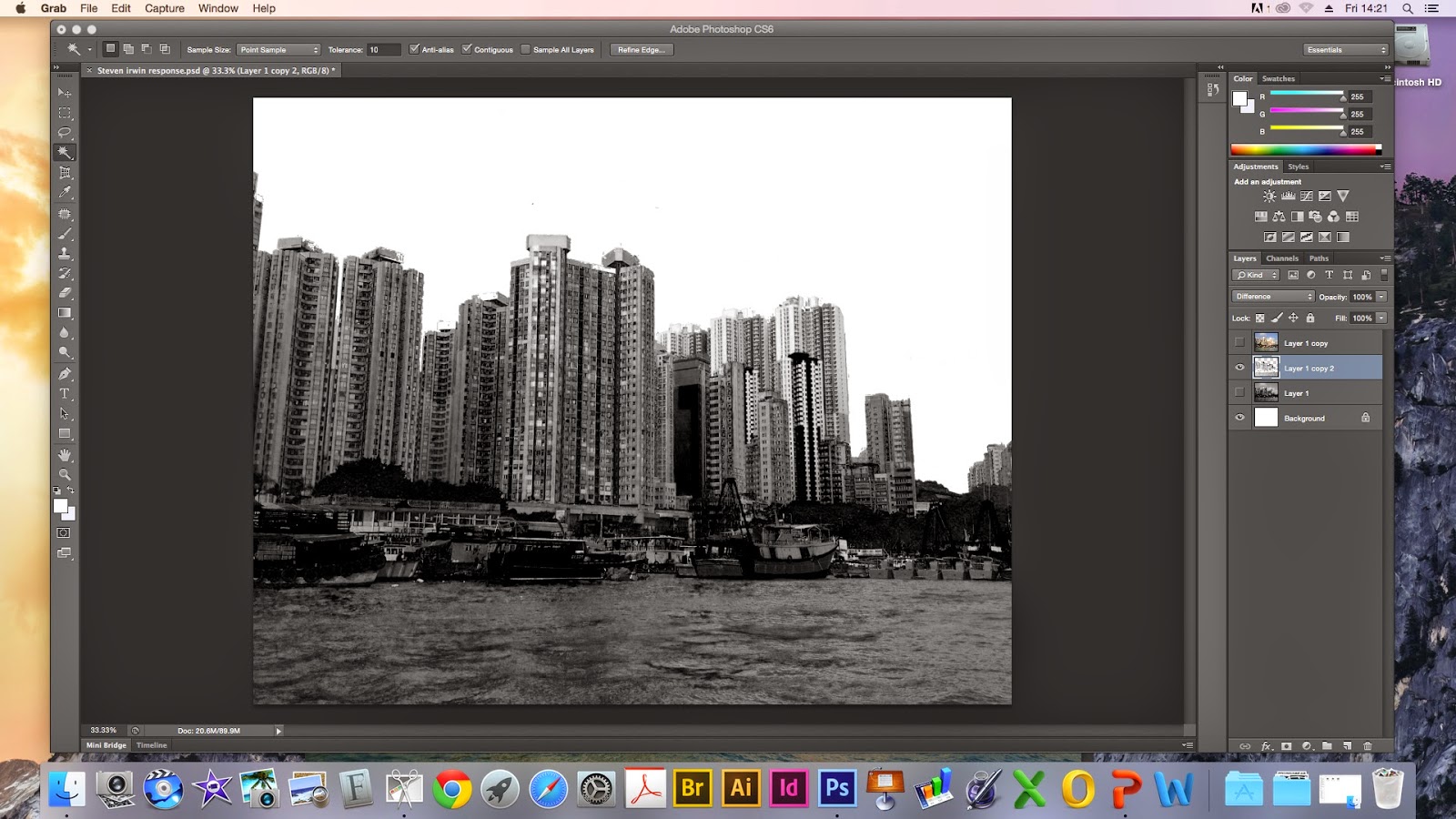
6. Then merge down the layers using the grid tool along the top of the layers panel. Then duplicate the black and white layer.

7. After that you need to select layer one (layer one copy 2) then go to image -> adjustments -> invert to create a negative image.


8. Go to the normal layer and change the settings of the merger. (make the layers interact) First i chose lighten then difference.


9. Select the sky- Hide the bottom layer (clicking on the eyeball) select the magic wand tool, keep an eye on the tolerance bar keep this at 10. Click the sky then hold shift key to highlight more sky.Then select the lasso tool and holding alt to get rid of the pixels entering the buildings. Use the alt key to take away and the shift key to add. (make sure the tool has a minus beneath it).

10. Press the back space button to get rid of the sky. Then click the eye button on the colour layer to bring back the sky. Then press the back space button to get rid of the blue sky. Make all layers visible then do command D. Following this go to the top layer and select the soft light.

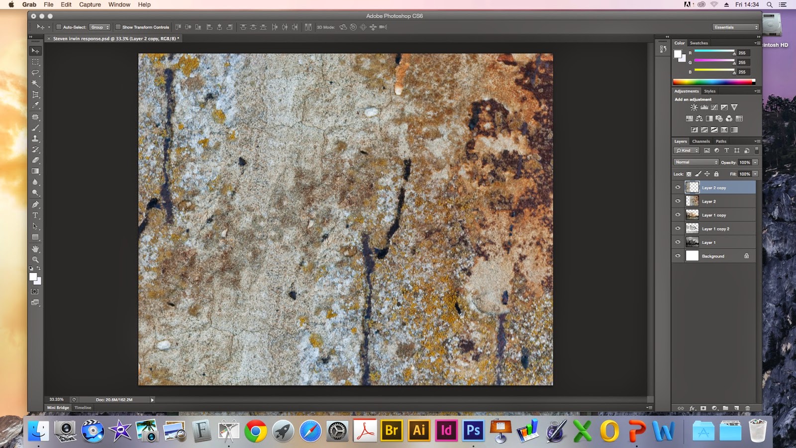
11. Open up the textured surface then move it across to your landscape image like step one. Then duplicate the layer again. 


12. Then move the rust so they join together across two layers -> edit transform -> flip horizontally and vertically.

15. Merge layers again as you did previously. Then go to image adjustment and levels to make the rust more vibrant.Go to normal again and select multiply.

16. Open last texture surface. Then open levels to make it richer then go to select and choose colour range. Then go to image select the brown area, then click back on the selection and change the fuzziness to 100. Then select okay.
17. The go to edit select copy, then paste it onto the other page. Then select edit and go to transform to make the rust smaller then rotate it.

18. Go to the bottom of the layers and select the box with a circle in to bring out a layer mask.
Then select the paintbrush tool, make the brush big and hard. After that you need to change the opacity to a lower number. After that you can select an area to take away. I've taken away a section near the top of the building.

These are my two finished pieces. The bottom one has a different merger effect.


For my response i'm really happy with my outcome because I didn't expect to be able to produce something like this because digital art is definitely not my forte. I did two different versions I prefer the bottom one because of the orange along the boats I think it brings a little life to the piece. Also having the  first layer of rust going along the whole landscape but more prominent in the corner really creates that decaying effect. It reminds me of the surface of the moon so it gives a surreal effect. The one thing I wish i could of improved is the sea, i wish i had made it more vibrant, or enhanced the shadows to give it a little more depth against the rust. For development I could try and replicate this using non-resistant materials like bleach and wax with ink?

Steve Irwin. 

Steve Irwin's work explores the co-existence and tension between nature and man made objects, His work is produced using photographs that are layered up. Most of his compositions have the element of decay to show the dying cycle of life, His most recent work is what inspired my workshop. His use of urban landscapes is what links psycho geography. His work is trying to make a statement. He's showing the evolution of a space and how maybe this is a step too far like global warming increasing and other issues that don't get enough attention. His work evokes a strong emotional reaction from me because of the way he layers the city landscape and has the decaying rust, the contrast between nature and man made objects is strangely terrifying because both are powerful beings. The way he evokes this reaction is probably due to the city being the background and the nature laying on top along with the decaying element centred around the edges. Also the use of dull colours combine to produce an almost morbid but weirdly calming piece, almost as if the landscape is trying to return to nature.