Wednesday 18 November 2015

Exquisite Corpse

Here are a couple of blogs that have helped inspire me when I need to generate ideas. They're also amazing illustrators. 
http://thewhitedeers.tumblr.com/
http://instagram.com/stefari
http://instagram.com/audraauclair

 Artist that are currently inspiring me: Peony Yip and Kiki Smith. 
Peony Yip

Peony Yip

Kiki Smith 

Kiki Smith 
Kiki Smith 
Peony Yip Aka the The white deer is a freelance illustrator living in Hong Kong. She produces superimposed drawings, often combining nature and human elements. What i really like about her work is how much detail she can fit into these illustrations while only using pencil. I also like the boldness of the red drawings that she overlays on her illustrations.

Kiki Smith is a multidisciplinary artist that works with a range of media solo and combined.  She's a german artist that focuses on cultural taboos bring them to life. she works with a range of material from sculpture, print and drawing. What i like about her is how she's able to bring up these social no no's with confidence, and they way she produces them is inspiring its not right in your face but its close enough. 

Here is some of the work I am currently working on. The first was a piece inspired by Peony Yip. I was trying to include as much detail as possible. The second was trying out a different painting technique by using layers and base tones. 

Monday 1 June 2015

Poster design

1880- Descent d'Absalon par miss stena. It's a circus poster.
1890- Paul w Faust- circus poster

1900- Fiat automobile. Advertisement poster.
1910- Ernest Montaut: p.Ruckmar and co

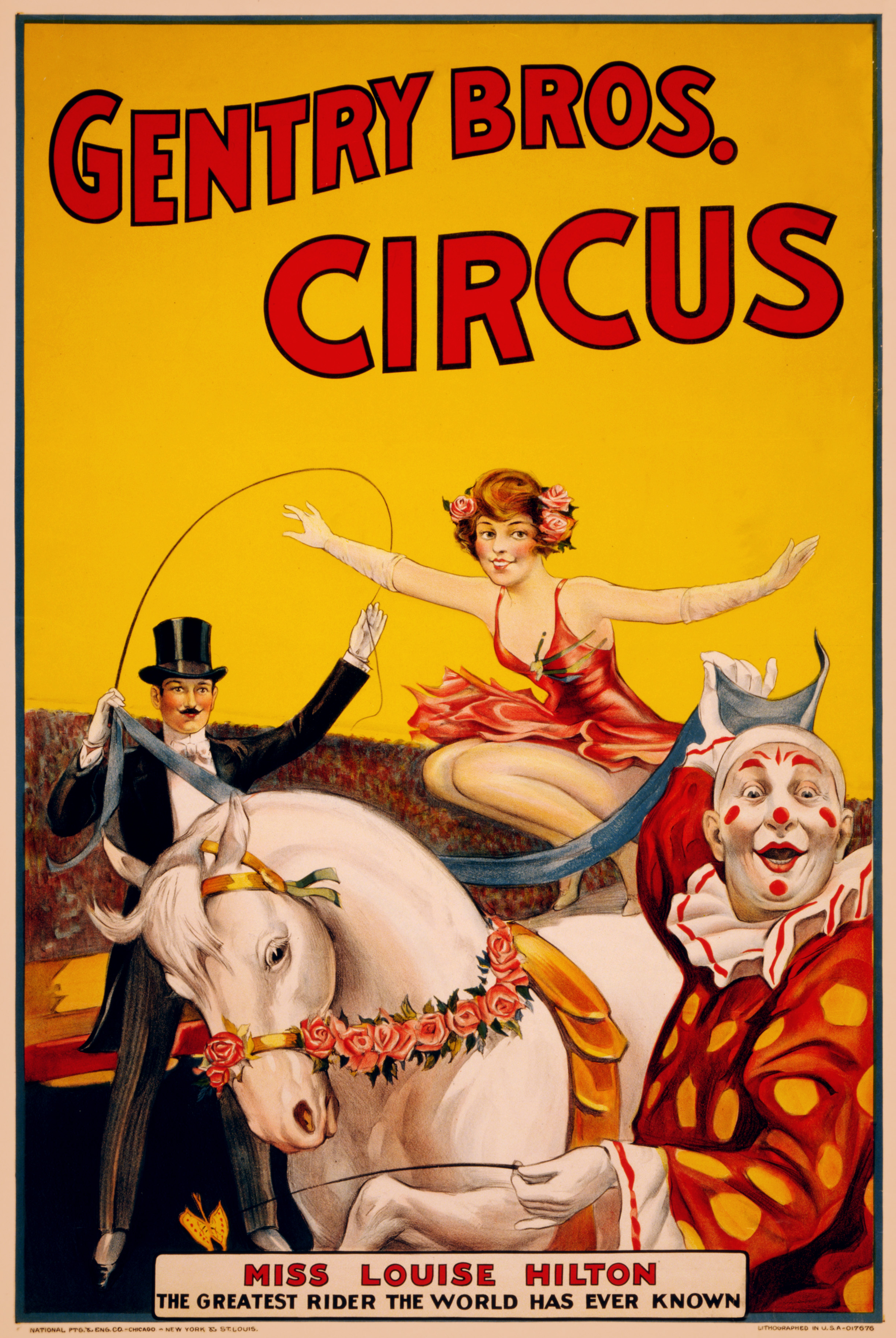
1920- Gentry bros. circus poster.

1930- Born reckless. Movie poster
1940- US census poster. Created by Census Bureau.
1950- The blonde bandit. Movie poster

1960- The Brides of Dracula. Movie poster by Terence Fisher 
1970- Czech poster for les gauloises bleues By Vaclav zeman.
1980- The blues brothers. Movie poster.
1990- Home alone movie poster.
2000- Final destination movie poster. 
2001- A Space Odysseus. Movie poster 

2002- Spider man movie poster.
2003- The hulk movie poster.

2004- The incredibles movie poster.

2005- King Kong movie poster.
Image result for king kong movie
2006- Charlottes web movie poster.

2007- Enchanted movie poster.

2008- Iron man movie poster.

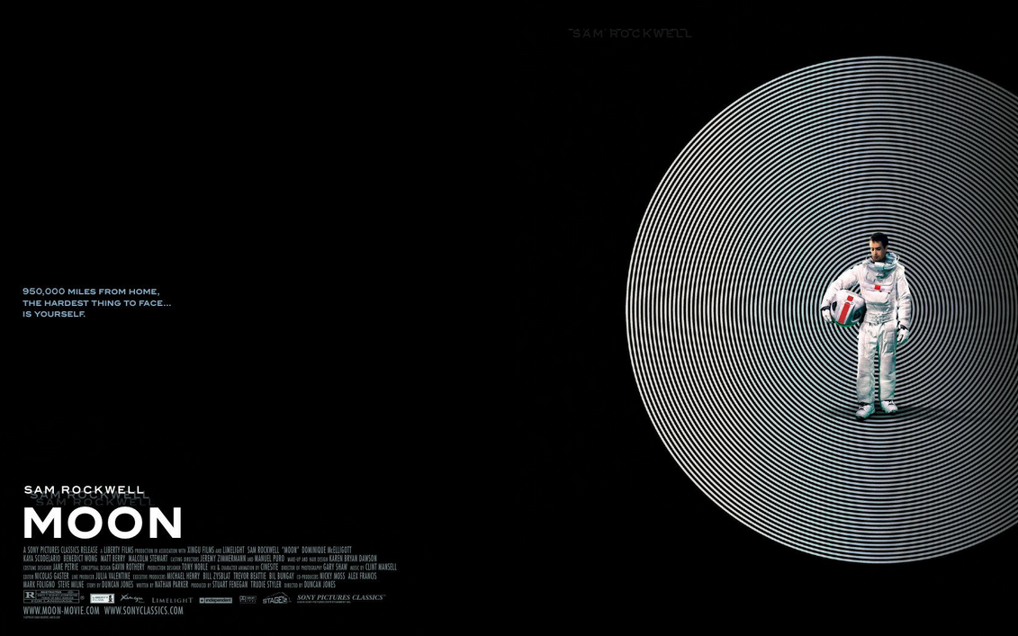
2009- the moon movie poster by pepper beretta.
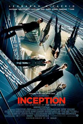
2010- inception movie poster.


INDENT- start (a line of text) or position (a block of text) further from the margin than the main body of the text.


Logo timelines

The company apple has evolved their logo over many years to keep it relevant and modern with the every changing current of society. Most people don't think much into the hidden meaning behind the apple but it's there. Even their first logo was related to an apple because it had Isaac Newton in, and when he discovered gravity and colours from an apple falling on his head. This logo was short lived though as rob janoff soon changed it to the simple design of an apple with a bit taken out, which was multicoloured. But again the times changed and the apple logo had to become more modern more simplistic. It first became monochrome but now it alternates between aluminium and  White. Over the years it's become more modern and it's so well known now that the company doesn't even have to put their name next to it, because the apple is iconic on its own already.
.Image result for apple logo timeline

My next company is nike. The Nike "Swoosh" is a design created in 1971 by Carolyn Davidson. The name nike was placed over the tick using a typeface that involved serifs. It then changed to San-serifs a more bold typeface with the tick placed underneath. The colour scheme changed when the third modified logo came about, to red and white, the logo had also been placed In a box. Till finally we come to the logo we all know today with is the simple red tick. The name nike is mo longer needed because it's automatically associated with Nike. The hidden meaning behind the tick isn't very clear, people have different assumptions.

My final company is the wwf and their famous panda logo what was inspired by the giant panda chi-chi. The first sketches were done by sir Peter Scott, they wanted an animal that was endangered but loved by all. It also had to have a big impact on black and white to keep printing costs down. Then over the years the logo has been tweaked to become more modern and sleek. Gone are the big bulky black lines they're replaced by the simple white back ground, the rough sketches have become softer the lines more carefree but precise. Even the shape has matured and grown to look more like a panda so it's easily recognised. And now it's one of the most well known logos of the century.